

Crossing the Line
This post continues our series on developing statistical models to explore the arcane relationship between UFO sightings and population. The previous post is available here: Bayes vs. the Invaders! Part One: The 37th Parallel.
The simple linear model developed in the previous post is far from satisfying. It makes many unsupportable assumptions about the data and the form of the residual errors from the model. Most obviously, it relies on an underlying Gaussian (or normal) distribution for its understanding of the data. For our count data, some basic features of the Guassian are inappropriate.
Most notably:
- a Gaussian distribution is continuous whilst counts are discrete — you can’t have 2.3 UFO sightings in a given day;
- the Gaussian can produce negative values, which are impossible when dealing with counts — you can’t have a negative number of UFO sightings;
- the Gaussian is symmetrical around its mean value whereas count data is typically skewed.
Moving from the safety and comfort of basic linear regression, then, we will delve into the madness and chaos of generalized linear models that allow us to choose from a range of distributions to describe the relationship between state population and counts of UFO sightings.
Basic Models
We will be working in a Bayesian framework, in which we assign a prior distribution to each parameter that allows, and requires, us to express some prior knowledge about the parameters of interest. These priors are the initial starting points for parameters Afrom which the model moves towards the underlying values as it learns from the data. Choice of priors can have significant effects not only on the outputs of the model, but also its ability to function effectively; as such, it is both an important, but also arcane and subtle, aspect of the Bayesian approach1.
Practically speaking, a simple linear regression can be expressed in the following form:
$$y \sim \mathcal{N}(\mu, \sigma)$$
(Read as “\(y\) is drawn from a normal distribution with mean \(\mu\) and standard deviation \(\sigma\)”).
In the the above expression the model relies on a Gaussian, or normal likelihood (\(\mathcal{N}\)) to describe the data — making assertions regarding how we believe the underlying data was generated. The Gaussian distribution is parameterised by a location parameter (\(\mu\)) and a standard deviation (\(\sigma\)).
If we were uninterested in prediction, we could describe the shape of the distribution of counts (\(y\)) without a predictor variable. In this approach, we could specify our model by providing priors for \(\mu\) and \(\sigma\) that express a level of belief in their likely values:
$$\begin{eqnarray}
y &\sim& \mathcal{N}(\mu, \sigma) \\
\mu &\sim& \mathcal{N}(0, 1) \\
\sigma &\sim& \mathbf{HalfCauchy}(2)
\end{eqnarray}$$
This provides an initial belief as to the likely shape of the data that informs, via arcane computational procedures, the model of how the observed data approaches the underlying truth2.
This model is less than interesting, however. It simply defines a range of possible Gaussian distributions without unveiling the horror of the underlying relationships between unsuspecting terrestrial inhabitants and anomalous events.
To construct such a model, relating a predictor to a response, we express those relationships as follows:
$$\begin{eqnarray}
y &\sim& \mathcal{N}(\mu, \sigma) \\
\mu &=& \alpha + \beta x \\
\alpha &\sim& \mathcal{N}(0, 1) \\
\beta &\sim& \mathcal{N}(0, 1) \\
\sigma &\sim& \mathbf{HalfCauchy}(1)
\end{eqnarray}$$
In this model, the parameters of the likelihood are now probability distributions themselves. From a traditional linear model, we now have an intercept (\(\alpha\)), and a slope (\(\beta\)) that relates the change in the predictor variable (\(x\)) to the change in the response. Each of these hyperparameters is fitted according to the observed dataset.
A New Model
We can now break free from the bonds of pure linear regression and consider other distributions that more naturally describe data of the form that we are considering. The awful power of GLMs is that they can use an underlying linear model, such \(\alpha + \beta x\), as parameters to a range of likelihoods beyond the Gaussian. This allows the natural description of a vast and esoteric menagerie of possible data.
The second key element of a generalised linear model is the link function that transforms the relationship between the parameters and the data into a form suitable for our twisted calculations. We can consider the link function as acting on the linear predictor — such as \(\alpha + \beta x\) in our example model — to represent a different relationship via a range of possible functions, many of which are inextricably bound to certain likelihood functions.
For count data the most commonly-chosen likelihood is the Poisson distribution, whose sole parameter is the arrival rate (\(\lambda\)). While somewhat restricted, as we will see, we can begin our descent into madness by fitting a Poisson-based model to our observed data. For Poisson-based generalised linear models, the canonical link function is the log — our linear predictor, rather than directly being the parameter \(\lambda\) is instead the logarithm of \(\lambda\). The insidious effects of this on the output of the model will become all too obvious as we persist.
Stan
To fit a model, we will use the Stan probabilistic programming language. Stan allows us to write a program defining a stastical model which can then be fit to the data using Markov-Chain Monte Carlo (MCMC) methods. In effect, at a very abstract level, this approach uses a random sampling to discover the values of the parameters that best fit the observed data3.
Stan lets us specify models in the form given above, along with ways to pass in and define the nature and form of the data. This code can then be called from R using the rstan package.
In this, and subsequent posts, we will be using Stan code directly as both a learning and explanatory exercise. In typical usage, however it is often more convenient to use one of two excellent R packages brms or rstanarm that allow for more compact and convenient specification of models, with well-specified raw Stan code generated automatically.
De Profundis
In seeking to take our first steps beyond the placid island of ignorance of the Gaussian, the Poisson distribution is a first step for assessing count data. Adapting the Gaussian model above, we can propose a predictive model for the entire population of states as follows:
$$\begin{eqnarray}
y &\sim& \mathbf{Poisson}(\lambda) \\
\log( \lambda ) &=& \alpha + \beta x \\
\alpha &\sim& \mathcal{N}(0, 1) \\
\beta &\sim& \mathcal{N}(0, 1)
\end{eqnarray}$$
The sole parameter of the Poisson is the arrival rate (\(\lambda\)) that we construct here from a population-wide intercept (\(\alpha\)) and slope (\(\beta\)). Note that, in contrast to earlier models, the linear predictor is subject to the \(\log\) link function.
The Stan code for the above model, and associated R code to run it, is below:
With this model encoded and fit, we can now peel back the layers of the procedure to see the extent to which it has endured the horror of our data.
The MCMC algorithm that underpins Stan — specifically Hamiltonian Monte Carlo (HMC) using the No U-Turn Sampler (NUTS) — attempts to find an island of stability in the space of possibilities that corresponds to the best fit to the observed data. To do so, the algorithm spawns a set of Markov chains that explore the parameter space. If the model is appropriate, and the data coherent, the set of Markov chains end up converging to exploring a similar, small set of possible states.
Validation
When modelling via this approach, a first check of the model’s chances of having fit correctly is to examine the so-called ‘traceplot’ that shows how well the separate Markov chains ‘mix’ — that is, converge to exploring the same area of the parameter space4. For the Poisson model above, the traceplot can be created using the bayesplot library:
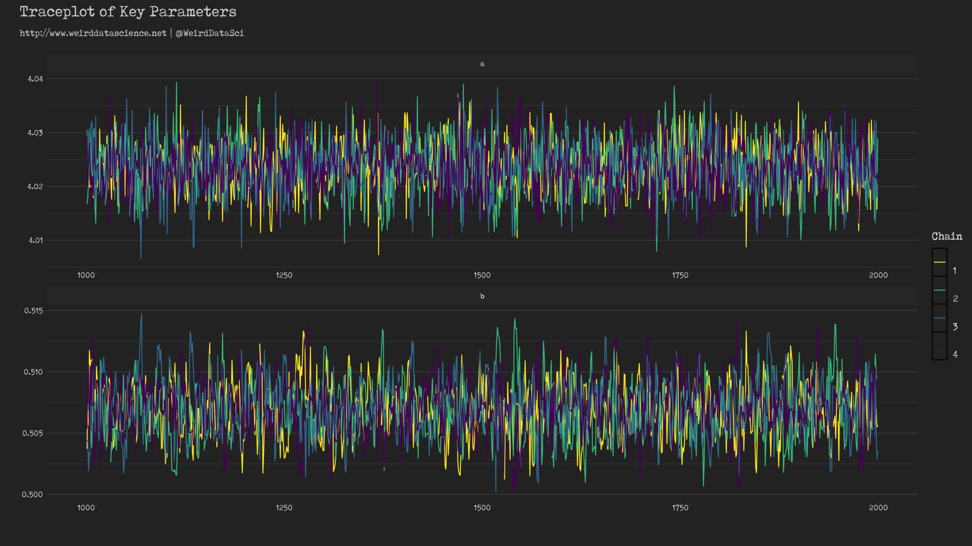
These traceplots exhibit the characteristic insane scribbling of well-mixed chains often referred to, in hushed whispers, as weirdly reminiscent of a hairy caterpillar; the separate lines representing each chain are clearly overlapping and exploring the same forbidding regions. If, by contrast, the lines were largely separated or did not show the same space, there would be reason to believe that our model had become lost and unable to find a coherent voice amongst the myriad babbling murmurs of the data.
A second check on the sanity of the modelling process is to examine the output of the model itself to show the value of the fitted parameters of interest, and some diagnostic information:
fit_ufo_pop_poisson %>%
summary(pars=c("a", "b" )) %>%
extract2( "summary" )
       mean      se_mean          sd      2.5%       25%       50%      75%     97.5%    n_eff      Rhat
a 4.0236045 1.026568e-04 0.004851688 4.0139485 4.0203329 4.0236485 4.026829 4.0330836 2233.626 0.9995597
b 0.5070227 6.206903e-05 0.002263160 0.5027733 0.5054245 0.5069979 0.508547 0.5115027 1329.477 1.0021745
For assessment of successful model fit, the Rhat (\(\hat{R}\)) value represents the extent to which the various Markov chains exploring the parameter space, of which there are four by default in Stan, are consistent with each other. As a rule of thumb, a value of \(\hat{R} \gt 1.1\) indicates that the model has not converged appropriately and may require a longer set of random sampling iterations, or an improved model. Here, the values of \(\hat{R}\) are close to the ideal value of 1.
As a final step, we should examine how well our model can reproduce the shape of the original data. Models aim to be eerily lifelike parodies of the truth; in a Bayesian framework, and in the Stan language, we can build into the model the ability to draw random samples from the posterior predictive distribution — the set of parameters that the model has learnt from the data — to create new possible values of the outcomes based on the observed inputs. This process can be repeated many times to produce a multiplicity of possible outcomes drawn from model, which we can then visualize to see graphically how well our model fits the observed data.
In the Stan code above, this is created in the generated_quantities block. When using more convenient libraries such as brms or rstanarm, draws from the posterior predictive distribution can be obtained more simply after the model has been fit through a range of helper functions. Here, we undertake the process manually.
We can see, then, how well the Poisson distribution, informed by our selection of priors, has shaped itself to the underlying data.
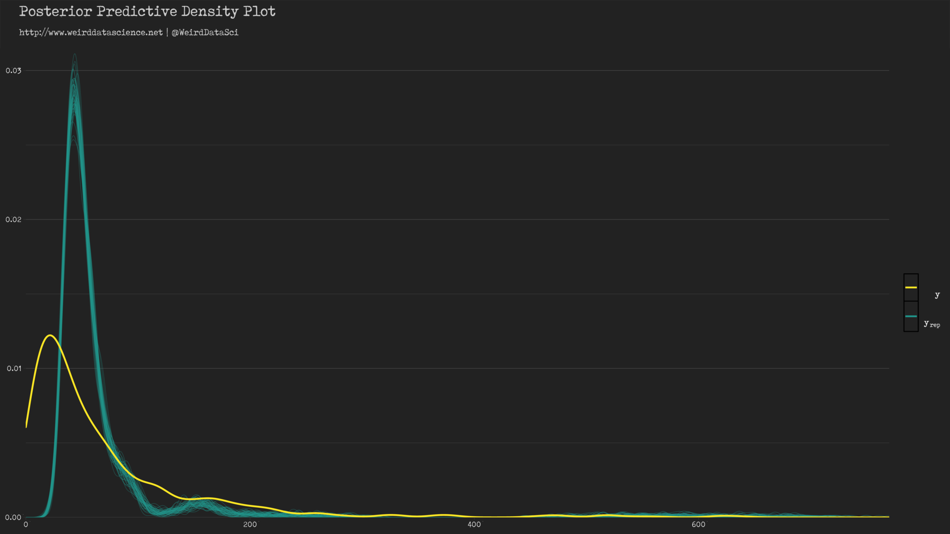
In the diagram above, the yellow line shows the densities of count values; the cyan lines show a sample of twisted mockeries spawned by our piscine approximations. The model has roughly captured the shape of the distribution of the original data, but demonstrates certain hideous dissimilarities — the peak of the posterior predictive distribution is significantly skewed away from the observed value.
To appreciate the full horror of what we have wrought we can plot the predictions of the model against the real data.
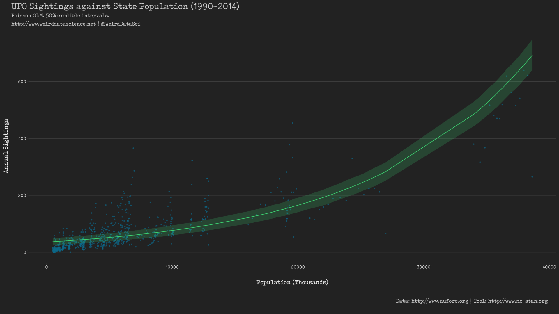
This shows a notably different line of best fit to that produced from the basic Gaussian model in the previous post. The most visible difference is the curved predictor resulting from the \(\log\) link function, which appears to account for the changes in the data very differently to the constrained absolute linearity of the previous Gaussian model5. Whether this is more or less effective remains to be seen.
Unsettling Distributions
In this post we have opened our eyes to the weirdly non-linear possibilities of generalised linear models; sealed and bound this concept within the wild philosophy of Bayesian inference; and unleashed the horrifying capacities of Markov Chain Monte Carlo methods and their manifestation in the Stan language.
Applying the Poisson distribution to our records of extraterrestrial sightings, we have seen that we can, to some extent, create a mindless Golem that imperfectly mimics the original data. In the next post, we will delve more deeply into the esoteric possibilities of other distributions for count data, explore ways in which to account for arcane relationships across and between per-state observations, and show how we can compare the effectiveness of different models to select the final glimpse of dread truth that we inadvisably seek.
Footnotes
- This is not a full, or even partially adequate, description of the Bayesian approach to statistical inference, and as such we will skip over a number of very significant details. This includes full discussion of the Bayesian approach, the difference between informative and uninformative priors, and the reasoning behind many of the choices made with respect to priors. An excellent, hugely engaging, and practical textbook for indoctrination into the cult of Bayesian inference is Statistical Rethinking by Richard McElreath.
- For practical reasons related to efficient computation and numerical stability, it is common practice to standardize the input data by centering and scaling it so that the mean value of the data is 0 and the variance is 1. Rather than being simply a convenience, this practice can have significant effects on both the speed and stability of models, and is highly recommended unless there is a good reason to avoid it.
- For a fuller explanation of the concepts behind this approach, the Stan website and the book Statistical Rethinking are enormously valuable references. For the deepest descent into the occult mysteries, Gelman et al.’s Bayesian Data Analysis is the key and the guardian of the gate.
- “Visualization in Bayesian workflow” by Gabry et al. is an excellent reference for the visual aspects of this approach to model checking.
- A direct comparison is slightly more complex, as the output of
geom_smoothis a frequentist 95% confidence interval, whereas this plot shows the Bayesian 95% credible interval. The difference between the two is beyond the scope of this post, but we will resolve this in our next steps.
2 Trackbacks / Pingbacks
-
Bayes vs. the Invaders! Part Two: Abnormal Distributions – Data Science Austria
-
Bayes vs. the Invaders! Part Three: The Parallax View | Weird Data Science
This site uses User Verification plugin to reduce spam. See how your comment data is processed.